
Positioning div elements for layout
This section covers CSS positioning. CSS positioning is a technology that uses CSS to position the screen of a website. Float and margin are properties that play an essential role in CSS positioning.
Float property
Typical element following float element does not recognize the existence of float element and acquire float box area. However, the contents of the two boxes do not invade each other's space.
<style type="text/css">
#A {
  float: left;
  width: 100px;
  background-color: #66f;
}
#B {
  background-color: #ddd;
}
</style>

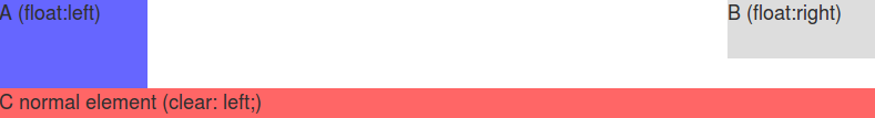
Clear property
The clear property values are left, right, and both. The following examples describe each value's exact meaning.
A has float: left.
B has float: right.
C has no clear property.
<style type="text/css">
#A {
  float: left;
  width: 100px;
  background-color: #66f;
}
#B {
  float: right;
  width: 100px;
  background-color: #ddd;
}
#C {
  background-color: #f66;
}
</style>

Added clear: left to #C.
<style type="text/css">
#A {
  float: left;
  width: 100px;
  background-color: #66f;
}
#B {
  float: right;
  width: 100px;
  background-color: #ddd;
}
#C {
  clear: left;
  background-color: #f66;
}
</style>
Change clear: left of #C to clear: right.
<style type="text/css">
#A {
  float: left;
  width: 100px;
  background-color: #66f;
}
#B {
  float: right;
  width: 100px;
  background-color: #ddd;
}
#C {
  clear: right;
  background-color: #f66;
}
</style>

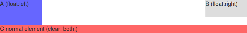
Change clear: right of #C to clear: both.
<style type="text/css">
#A {
  float: left;
  width: 100px;
  background-color: #66f;
}
#B {
  float: right;
  width: 100px;
  background-color: #ddd;
}
#C {
  clear: both;
  background-color: #f66;
}
</style>
Negative Margins
It is possible to assign negative numbers for the margin values. Negative margins can minimize the number of elements required for the screen.
First, let's look at an example of elements that does not have negative margins.
<style type="text/css">
#A {
  float: left;
  width: 100px;
  background-color: #66f;
}
#B {
  float: left;
  width: 100px;
  background-color: #ddd;
}
</style>

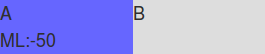
Suppose you assign a negative value to the margin-left of #A, #A moves to the left by that value. #B moves along #A too.
<style type="text/css">
#A {
  float: left;
  width: 100px;
  margin-left: -50px;
  background-color: #66f;
}
#B {
  float: left;
  width: 100px;
  background-color: #ddd;
}
</style>
If you assign a negative value to #A's margin-right, #A pulls #B towards himself and increases #B as much as that value.
<style type="text/css">
#A {
  float: left;
  width: 100px;
  margin-right: -50px;
  background-color: #66f;
}
#B {
  float: left;
  width: 100px;
  background-color: #ddd;
}
</style>

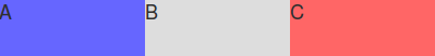
3 column layout
#A, #B, #C have float: left. Because they do not have negative margins, each element does not invade other areas.
<style type="text/css">
#A {
  float: left;
  width: 100px;
  background-color: #66f;
}
#B {
  float: left;
  width: 100px;
  background-color: #ddd;
}
#C {
  float: left;
  width: 100px;
  background-color: #f66;
}
</style>
Modify #A's width value from 100px to 100%.
<style type="text/css">
#A {
  float: left;
  width: 100%;
  background-color: #66f;
}
#B {
  float: left;
  width: 100px;
  background-color: #ddd;
}
#C {
  float: left;
  width: 100px;
  background-color: #f66;
}
</style>

There are #B and #C under #A. But it would help if you thought that #A, #B, and #C are side by side because all three boxes are float boxes.
Add margin-right: -100% to #A.
You can confirm #B and #C overlap on the left side of #A.
<style type="text/css">
#A {
  float: left;
  width: 100%;
  margin-right: -100%;
  background-color: #66f;
}
#B {
  float: left;
  width: 100px;
  background-color: #ddd;
}
#C {
  float: left;
  width: 100px;
  background-color: #f66;
}
</style>

Remove margin-right: -100% from #A. Add margin-left: -100% to #B.
You can confirm that #B overlaps on the left side of #A, and #C moves to the original #B position.
<style type="text/css">
#A {
  float: left;
  width: 100%;
  background-color: #66f;
}
#B {
  float: left;
  width: 100px;
  margin-left: -100%;
  background-color: #ddd;
}
#C {
  float: left;
  width: 100px;
  background-color: #f66;
}
</style>

Add margin-left: -100px to #C. (100px is the width of C element)
You can confirm that #C moves on the right side of #A.
<style type="text/css">
#A {
  float: left;
  width: 100%;
  background-color: #66f;
}
#B {
  float: left;
  width: 100px;
  margin-left: -100%;
  background-color: #ddd;
}
#C {
  float: left;
  width: 100px;
  margin-left: -100px;
  background-color: #f66;
}
</style>

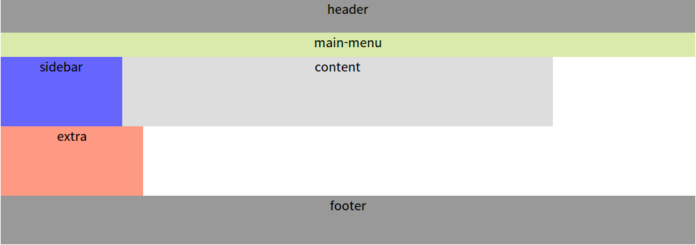
Website Design using 3 column layout with fixed width
The screen consists of #header, #man-menu, #sidebar, #content, #extra, #footer.
- header: It is located at the top and contains the company logo image.
- main-menu: It is under the header and displays the main menu.
- sidebar: It shows the submenu on the left of the screen.
- content: It shows actual contents on the center of the screen.
- extra: It shows ads on the right side of the screen.
- footer: It is located at the bottom and contains global menus such as Copyright, Contact, Directions, etc.
The size of the elements mentioned above is specified as follows.
header
width: 1000px
height: 48px
main-menu
width: 1000px
height: 35px
sidebar
width: 175px
content
width: 720px
extra
width: 205px
footer
width: 1000px
height: 70px
Default HTML document
Copy the following and paste it to your editor.
<!DOCTYPE html>
<html lang="en">
<head>
<meta charset="UTF-8" />
<meta name="Keywords" content="keywords" />
<meta name="Description" content="description" />
<title>title</title>
<link rel="stylesheet" href="css/screen.css" type="text/css" />
</head>
<body>

</body>
</html>
Save it as index.html on the document base. Paste the following to the body elements of index.html.
<div id="wrap">

  <div id="header">header</div>

  <div id="main-menu">main-menu</div>

  <div id="container">
    <div id="content">content</div>
  </div>

  <div id="sidebar">sidebar</div>

  <div id="extra">extra</div>

  <div id="footer">footer</div>

</div>
The #wrap and #container are extra elements needed for an unbreakable layout. The #wrap wraps all divs in the document. The #container is required to place three columns.
The #content comes before the #sidebar. The #content element is the most important and frequently changed on the web page, so it is advantageous for maintenance if it comes more first.
Create a folder named css on the document base and create a screen.css file in css folder with the following content:
@CHARSET "UTF-8";
/*** The Essential Code ***/
html, body {
  margin: 0;
  padding: 0;
  background-color: #FFF;
  font-family: "Liberation Sans", Helvetica, sans-serif;
  font-size: 1em;
}
#wrap {
  margin: 0 auto;
  padding: 0;
  width: 1000px;
}
#header {
  width: 1000px;
  height: 48px;
}
#main-menu {
  width: 1000px;
  height: 35px;
}
#container {
  width: 100%;
}
#content {

}
#sidebar {
  width: 175px;
}
#extra {
  width: 205px;
}
#footer {
  height: 70px;
}
/*** Just for Looks ***/
#header, #footer {
  font-size: large;
  text-align: center;
  background: #999;
}
#main-menu {
  font-size: large;
  text-align: center;
  background: #DAEAAA;
}
#content {
  font-size: large;
  text-align: center;
  background: #DDD;
  height: 100px;
}
#sidebar {
  font-size: large;
  text-align: center;
  background: #66F;
  height: 100px;
}
#extra {
  font-size: large;
  text-align: center;
  background: #F66;
  height: 100px;
}
The content of the CSS document is an iteration of the following form:
Selector {
  Property: value;
  ..
  .
}
There are various types of selectors such as Type, Descendant, Class, Id, Child, and Attribute.
The following shows each selector.
/* Type Selector */
body {

}
/* Descendant Selector */
ul strong {

}
/* Class Selector */
.redwine {

}
/* id Selector */
#header {

}
/* Child Selector */
body > p {

}
/* attribute Selector */
input[type="text"] {

}
The selector that begins with # is the Id selector. The Id selector gives styles to unique elements in the HTML document. In index.html, wrap, header, main-menu, container, content, sidebar, extra, and footer are unique elements.
The selector that begins with a dot (.) is the Class selector.
- div.redwine vs div .redwine
- div.redwine gives styles to <div class="redwine">.
- div .redwine gives styles to elements that are descendants of div whose class is redwine.
Double-click the index.html to see the design. No web server is required.

screen.css
Let's take a look at the contents of the CSS file.
html, body
html, body {
  margin: 0;
  padding: 0;
  background-color: #FFF;
  font-family: "Liberation Sans", Helvetica, sans-serif;
  font-size: 1em;
}
The above give styles to both html and body elements. Unlike div, html and body elements have default margins and padding. So, most web designers set margins and padding of html and body to zero, then start designing.
#wrap
#wrap {
  margin: 0 auto;
  padding: 0;
  width: 1000px;
}
The margin needs four values. When you set four values to margin, each value is assigned to top, right, bottom, left in order. When you set only one value to margin (e.g, margin: 100px), 100px is assigned to top, right, bottom, left. When you set two values to margin (e.g, margin: 100px 50px), 100px is assigned to top and bottom, and 50px is assigned to right and left. When you set three values to margin (e.g, margin: 100px 50px 25px), 100px is assigned to top and 50px is assigned to right and 25px is assigned to bottom in order. Left margin is assigned to equal to right.
You can set auto to margin. This value lays the element to center or middle. #wrap is centered because its second margin value is auto.
The default margin and padding of div elements are zero.
The contents of the CSS file are divided into /*** Essential Code ***/ and /*** Just for Looks ***/. /*** Just for Looks ***/ is for screen test, which disappears when the CSS file is completed.
#container
#container {
  width: 100%;
}
100% means the maximum extent to which the content of the #container can fit. Since the margin and padding of the #container are zero and no border is set, 100% is 1000px like the #wrap.
Set left and right margins of #content
Modify #content of /*** Essential Code ***/ as shown below.
#content {
  margin-left: 175px;
  margin-right: 205px;
}
The above settings are the same as the following settings:
margin: 0 205px 0 175px;

Add float: left to #container, #sidebar, #extra
To place #sidebar on the left of #content and #extra on the right of #content, Modify the following at /*** The Essential Code ***/
#container {
  float: left;
  width: 100%;
}
#content {
  margin-left: 175px;
  margin-right: 205px;
}
#sidebar {
  float: left;
  width: 175px;
}
#extra {
  float: left;
  width: 205px;
}
#footer {
  clear: both;
  height: 70px;
}
Added float: left to #container and #sidebar and #extra.
Because #container, #sidebar, and #extra are float elements, you should think that they are side by side, not up and down like boxes in normal flow.
Added clear: both to #footer to prevent #content, #sidebar, and #extra content from invading #footer.

Place #sidebar on the left of #content
Add the following to #sidebar in the /*** The Essential Code ***/
#sidebar {
  float: left;
  width: 175px;
  margin-left: -1000px;
}
The margin-left: -100% has same effect.
Place #extra on the right of #content
Add the following to #extra.
#extra {
  float: left;
  width: 205px;
  margin-left: -205px;
}
 References
- http://www.html.net/tutorials/css/
- http://www.subcide.com/articles/creating-a-css-layout-from-scratch/P1/
- http://www.alistapart.com/articles/holygrail/
- http://coding.smashingmagazine.com/2009/07/27/the-definitive-guide-to-using-negative-margins/
- http://www.w3.org/QA/2002/04/valid-dtd-list.html
- http://www.ibm.com/developerworks/kr/library/wa-css/
- http://www.maxdesign.com.au/articles/css-layouts/